Building the California Design System required a lot of decisions. We made many of them with our partners at the Department of Technology (CDT). Some involved new ways of doing things in state government.
Here are the key decisions we made and the benefits each brings.
Web components
When a component requires JavaScript for interactivity we use custom elements. This allows us to take advantage of the component model built into the browser. This makes the Design System framework agnostic. The state has a lot of web services running on a variety of tech stacks. Web components make the Design System work smoothly on any of them. We describe our web components approach in more detail on the Design System site.
Minimizing tech in each component
Many components don’t need JavaScript. We use only CSS & HTML where we can. This limits complexity for teams who want to use a few components or even just one. We aren’t relying on an underlying CSS framework. We provide a well-tested set of tools that work without requiring underlying dependencies.
Prioritizing performance
Delivering fast, reliable sites to everyone is a priority for the Office of Digital Innovation. Performance affects everybody and for some it makes all the difference. Faster pages also have higher conversion levels and better user satisfaction.
Performance is also an equity issue. One scenario we thought about is people who get phones through LifeLine. People can get phones based on their income or if they’re in certain state programs. For example, you can get an incredibly capable Android device running the latest version of the Android OS for $20.
But there’s a huge difference in CPU capability between these phones and the latest iPhone. In some cases they are executing client-side JavaScript 60 times slower! This can create huge delays for people on cheaper phones and with limited data plans. Waiting over a minute for a webpage to let you click on stuff is a major barrier to meeting your needs.
We tested the Design System to make sure it will not weigh your site down and inconvenience your visitors.
We’ve built several fast sites using Design System components:
| drought.ca.gov | covid19.ca.gov | digital.ca.gov |
|---|---|---|
drought.ca.gov 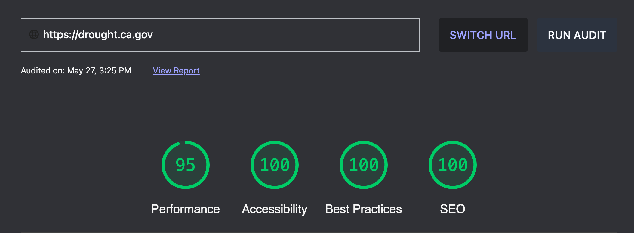 | covid19.ca.gov 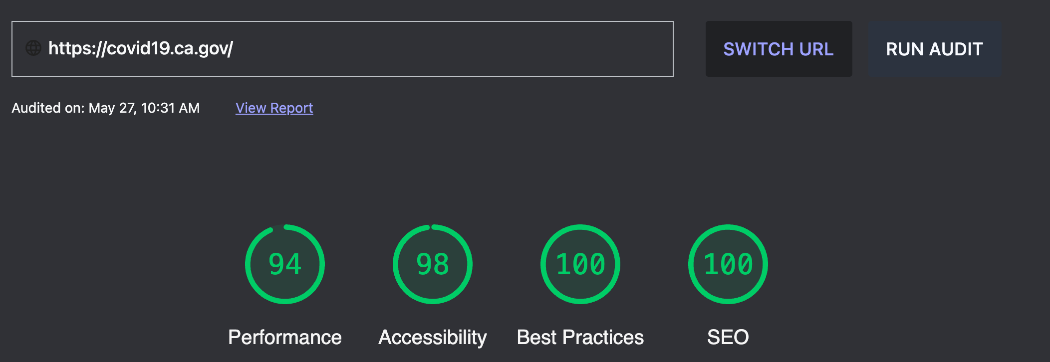 | digital.ca.gov 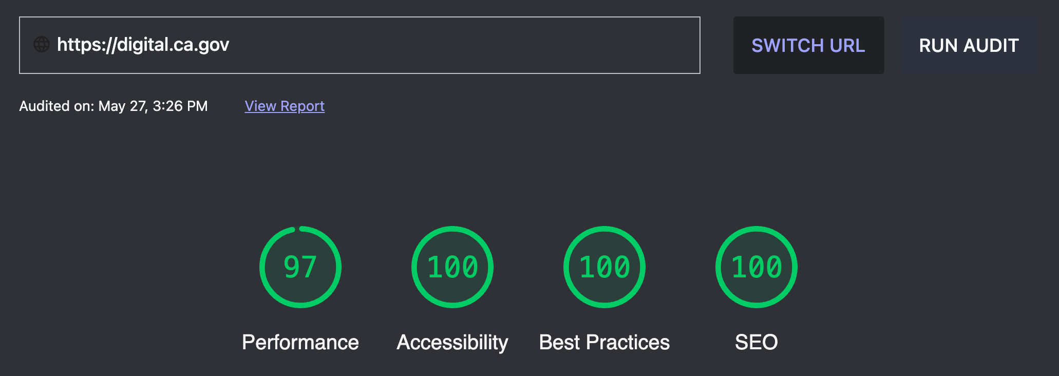 |
Progressive enhancement
Browser popularity changes over time, but there’s always a long tail of browsers people will use. Many teams aren’t going to have time to test them all.
We make sure Design System components provide basic functionality to everybody. We focus on basic features that work without JavaScript. We also level up interactivity when browsers support improved capabilities. This gives us the best chance of not excluding visitors using a rare device or browser.
ES6
We take advantage of recent ES6 features in JavaScript such as modules. We don’t provide transpiled bundles to support older browsers. Instead we focus on progressive enhancement. We include component code with <script type=module…>. This lets rarer, older devices that don’t support ES6 modules ignore it. Developers can integrate components into their pipelines and output the bundles they need.
Focus on documentation
We have extensive documentation on each component in a README.
We use the README markdown content for both:
- The content on the component’s detail page on the Design System website
- Its package homepage on npm
Accessibility testing
It’s wonderful that state law says state web services must be accessible. Teams throughout the state are constantly making sure their services work for everybody.
We built Design System components to make that easier for state developers. We test each component rigorously so you can integrate it anywhere and have it work for any visitor.
Our component maturity model describes how we ensure each component is accessible. The automated steps run during each commit to the Design System repository. Our accessibility verification process for each component includes:
- Testing with the axe accessibility tool and passes all automated AA level checks
- Reviewing with the VoiceOver screen reader on desktop
- Reviewing with the TalkBack screen reader on mobile
- Verifying you can reach all all actionable elements via keyboard commands only
- Reviewing the component layout on a variety of screen sizes
- Reviewing the component display using content in:
- English
- Spanish
- Simplified Chinese
- German
- Arabic (using right to left display)
Individual component management
All components are published as separate packages to npm. This means you can integrate them individually and manage them as a single integration. This lets you use a single component without adopting the entire Design System.
We’re doing this right now on one of California’s most viewed pages: the ca.gov homepage. We added the page feedback widget at the bottom of the page. It’s the first Design System component used on that site.
It doesn’t use the npm package. Instead, it retrieves the versioned source code from our CDN. This means you can upgrade by changing the version in the URL. We recommend you use a bot in your GitHub repo when you install components as npm packages. This will alert you to new versions of components. (Our current favorite is dependabot.)
User-driven development
We know we’re not the only people in California with good ideas. That’s why we get feedback from Californians and other state teams.
In particular, CDT has provided great thoughts on how to make the Design System better. They’re now driving the development of the Design System. CDT’s goal is to replace the State Web Template with the Design System. We’re really excited about this future for state websites!
Our GitHub repo is open to public view and comment. Many people have contributed to the Design System through it.
Outside thoughts help us improve the usability of Design System components. We’ve learned from state digital teams:
- How they manage their services
- What web components they use
- How the Design System can best support them
We regularly glean insights from the staff attending Digital Web Services Network meetings. For example, we learned recently that teams need to be able to customize components.
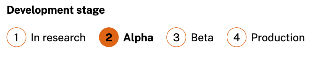
Publicizing component maturity
Components move through maturity levels based on user testing and other requirements. We display the status at the top of component pages on the Design System site:
This clearly flags early versions of components as not yet fully baked. This gives us the freedom to use an iterative development process where we:
- Ship versions of components on real sites
- Do user testing
- Gather feedback from developers
- Improve components based on what we learned
Our promotion requirements are strict, especially in the later stages. If we make radical changes to a component we might even move it backwards on the maturity scale. This gives developers confidence that mature components are fully vetted for:
- Accessibility
- User experience
- Performance
- Ease of use
The entire Design System is still in Beta status (though many components are still in Alpha). We’re still gathering more feedback from people and improving these tools.
We want your ideas
We’re interested in hearing about widgets that might be useful for state teams! If you have something you think would be a good candidate to be part of California’s open source design system, let us know. We’d love to collaborate!